
Style your form
Match a form to your brand using themes, colors, fonts, button styles, and layout controls.
A form that clashes with the rest of your page — wrong colors, default fonts, a generic gray button — reads as an afterthought, and visitors notice. The styling tools built into the form builder let you match a form to your brand in a few minutes, without writing any code.
Where styling lives
Open any form (or survey) in the builder and click Styles & Options in the top-right. This opens a panel with everything covered in this article: themes, colors, typography, layout, and — for advanced users — custom CSS.
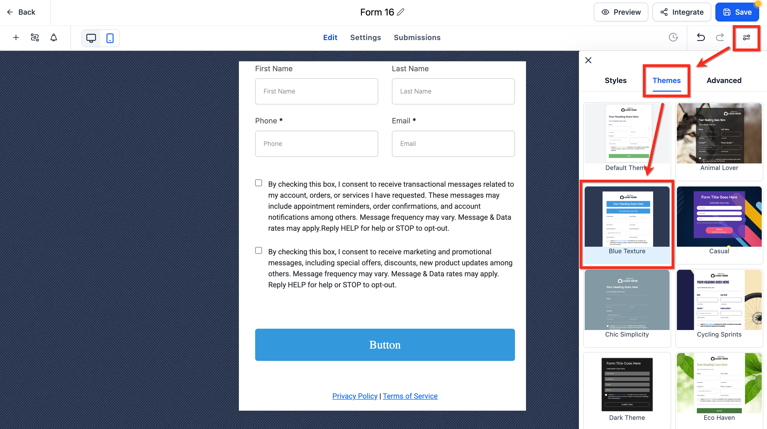
Start with a theme
The fastest path to a good-looking form is a theme — a bundled, pre-built combination of colors, fonts, spacing, and button style. Click the Themes tab and browse the available presets.
Tip: Pick the theme closest to your brand colors first, then fine-tune individual settings afterward, rather than building every style choice from a blank slate. It's much faster and keeps things visually coherent.
Themes exist so that every form and survey across your account can share a consistent look without you having to reset colors, fonts, and spacing by hand each time. If you're building several forms for the same brand, apply the same theme to all of them (or duplicate a form you've already styled) rather than styling each one independently — consistency here matters more than most people expect, especially for forms embedded across multiple pages or sites.
Colors and background
Under Colors & Background, you can set:
- Background color — the form's container background. Usually white or your brand's light neutral, so text stays readable.
- Input color and border — the fill and outline of each field's input box. Keep this high-contrast against the background; low-contrast input borders are a common reason forms feel "hard to use" even when nothing is actually broken.
- Background image — you can upload a custom background image, but note that the theme's default background image has to be removed first before the upload control becomes available.
Warning: Resist the urge to use a busy background image behind a form. Anything that competes visually with the input fields increases the chance a visitor misreads a field or abandons partway through. If you use one, keep it subtle and low-contrast.
Button styling
Under Button Themes, choose from pre-built styles:
- Filled — a solid-color button, the highest-contrast and generally best-converting option for a primary call to action.
- Border — an outlined button with a transparent or light fill, useful as a secondary action but usually weaker as your only submit button.
- Text Only — minimal styling, best reserved for low-emphasis links rather than your main conversion action.
Each style comes with curated color, typography, and spacing presets you can still adjust individually. For most lead-capture forms, a Filled button in a color that visually pops against the form background (not necessarily your primary brand color, if that color is already used everywhere else on the page) tends to draw the eye and convert best.
Typography, layout, and spacing
Further down the panel you'll find:
- Typography — font family, size, and weight for labels, input text, and the button.
- Layout & Alignment — how fields are arranged (see Build your first form for Single Column / Two Column / Single Line layout options), plus a Spread to Column option that evenly distributes field widths across a row instead of leaving uneven gaps.
- Padding — internal spacing around the form and each field, which affects how "roomy" or "compact" the form feels.
- Border & Corner Radius — sharp corners read as more formal/technical; rounded corners read as friendlier and more casual. Match whichever your brand already uses elsewhere on the page.
- Shadow — a subtle drop shadow can help a form visually separate from a busy page background; skip it on already-clean, minimal pages where it just adds noise.
- Full Width toggle — lets the form stretch to fill its container instead of sitting at a fixed max width. Useful inside narrow page sections; usually best left off for a form embedded in a wide layout, where a full-bleed form can look stretched and awkward.
Inline vs. full-width: which to choose
There's no single right answer — it depends on where the form lives:
- Inline / fixed-width forms sit naturally inside a sidebar, a modal, or a narrow content column, and generally look tidier alongside other page content.
- Full-width forms work well as a dedicated section on a landing page (e.g., a "Get Started" section that spans the page), where the form is the focus of that section rather than one element among several.
Preview the page at the width it'll actually be viewed on — desktop and mobile — before deciding; a layout that looks right at one width can feel cramped or oversized at another.
Advanced: custom CSS
If the built-in controls don't cover something specific your brand needs, open the Advanced Section under Styles and use the Custom CSS box to write your own styles targeting the form's elements. This is optional and intended for anyone comfortable writing CSS — most forms never need it, since the built-in theme controls cover the vast majority of styling needs.
/* Example: tighten spacing between fields */
.form-field {
  margin-bottom: 12px;
}
Warning: Custom CSS is applied per form. If you update your brand colors later, you'll need to revisit any form using custom CSS individually — it won't inherit changes the way theme-based styling does.
What done looks like
A well-styled form should feel like it belongs on the page it sits on: brand colors and fonts carried through, a button that's the clear visual focal point, comfortable spacing between fields, and no layout breakage when you resize the browser down to a phone width. Preview on both desktop and mobile before publishing.
Related articles
- Build your first form
- Add a form to a page or embed it externally
- How forms, contacts, and custom fields work together
Frequently asked questions
Will changing a form's theme affect submissions that already came in?
No. Styling is purely visual and applies only to how the form displays going forward — it has no effect on data already submitted or stored on contact records.
Can two forms on the same page have different styles?
Yes, styling is set per form, so you can have differently styled forms on the same page if needed — though for a consistent visitor experience, it's usually best to keep one style per page.
Does styling affect how fast the form loads?
A background image or heavy custom CSS can add a small amount of load time. Since page speed has a measurable effect on form conversion, keep background images reasonably sized and avoid unnecessary custom CSS if performance is a concern.